

Popup Builder
Create engaging popups effortlessly to capture leads, promote offers, and announcements.
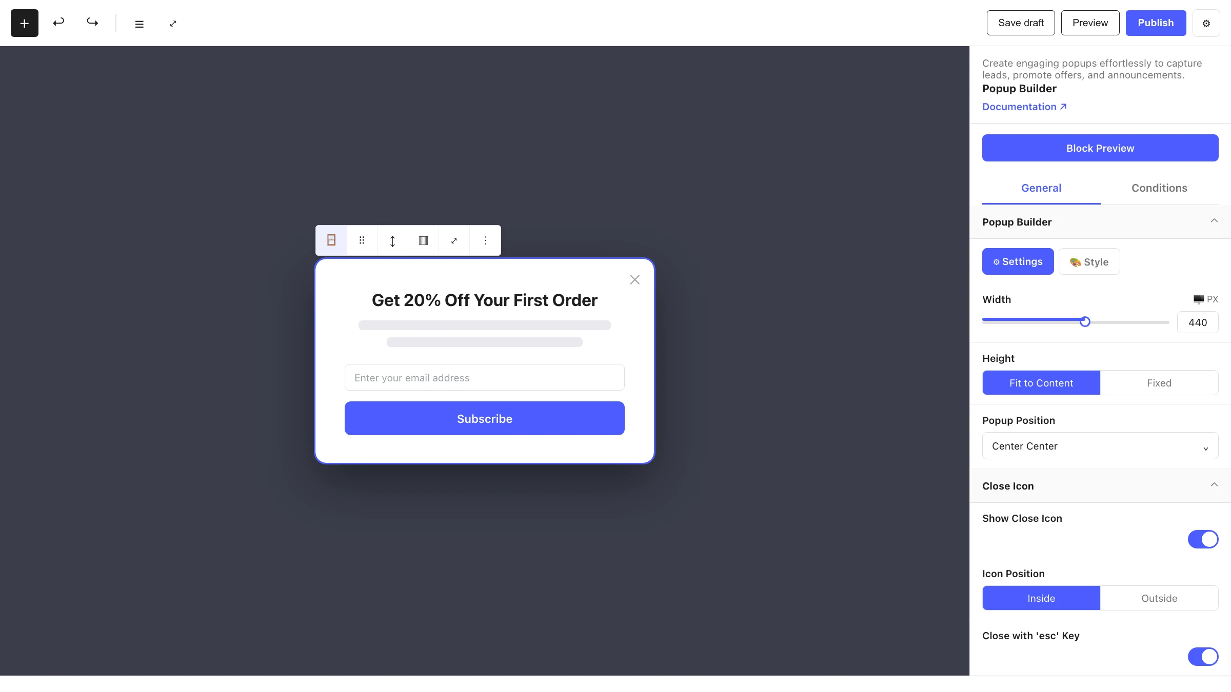
The Popup Builder block is the shell of a Styble popup. You don't add it from the normal block inserter — instead you create a popup from the Popups area in the dashboard, which opens a dedicated editor with this block as the locked root. Inside it you build your content with regular Styble blocks, and on the inspector you control how the popup looks, when it triggers, who sees it and how often.
When to use it
- To capture leads with a newsletter or contact form.
- To promote offers, discounts or announcements.
- To show exit-intent or scroll-triggered messages.
- To display targeted, scheduled or audience-specific messaging.
How to add it
Popups are created and managed from the dashboard, not inserted into a page:
- Open the Popups area in the Styble dashboard.
- Click Create New Popup (start blank or from a template).
- The block editor opens with a Popup Builder as the locked root block.
- Add your content inside it (text, buttons, images, containers), then configure triggers and conditions in the inspector.
- Publish and enable the popup; it then displays on your site according to its conditions.
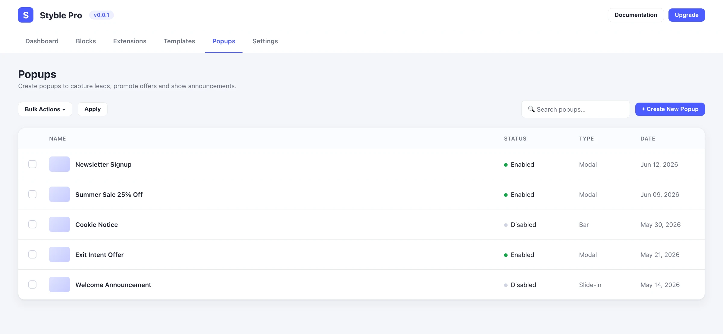
See the Popups dashboard guide for managing, enabling and tracking popups.
Settings
Select the Popup Builder and open the inspector. Its settings are organized into two tabs: General (appearance and behaviour of the popup itself) and Conditions (when, where and to whom it shows). The shared Advanced controls also apply.
General tab
Popup Builder
| Control | What it does |
|---|---|
| Width | Popup width (px / % / vw, responsive). |
| Height | Fit to Content or Fixed. |
| Fixed Height | Set height when Height is Fixed (px / vh). |
| Popup Position | Place the popup on a 9-point grid — corners, edges or center. |
The panel's Style tab adds the Overlay (transparent / solid / gradient) with Overlay Opacity, the popup Background, Border, Border Radius and Box Shadow.
Close Icon
| Control | What it does |
|---|---|
| Show Close Icon | Enable the close button. |
| Icon Source | Use an icon from the library or an uploaded image. |
| Icon Size | Size of the close icon. |
| Icon Position | Place it Inside or Outside the popup. |
| Corner Position | Top Left/Right or Bottom Left/Right. |
| Offset | Fine-tune X/Y placement. |
| Close with 'esc' Key | Allow closing with the Escape key. |
| Close on Outside Click | Close when the overlay is clicked. |
| Show Close Icon After | Delay before the close icon appears (seconds). |
Animation & Sound
| Control | What it does |
|---|---|
| Entrance Animation | How the popup appears (Fade, Zoom, Bounce, Slide, Rotate, Flip and more). |
| Exit Animation | How the popup leaves. |
| Animation Duration | Length of the animations (seconds). |
| Opening Sound | Optional sound played when the popup opens, with a volume control. |
Conditions tab
Display Conditions
| Control | What it does |
|---|---|
| Display On | Entire Site, Archives or Specific Pages. |
| Select Pages / Exclude Page(s) | Choose where the popup shows or is suppressed. |
| Trigger | When it opens — Page Load, Scroll, Click, Exit Intent or After Inactive. |
| Scroll Depth | The scroll percentage that triggers it (Scroll trigger). |
| CSS Selector for Click | The element(s) that open it (Click trigger). |
| Automatically Close After | Auto-dismiss the popup after a number of seconds. |
| Page Scrolling | Allow or block page scrolling while the popup is open. |
Audience & Frequency Settings
Target Display to Visitor (Everyone, Returning or New), set the Display Frequency (Once a Day, Every Visit, Every Session, Once Every Few Days/Visits), gate by page views or session count, match an arriving-from URL, and optionally Hide for Logged In Users.
Targeting Geolocation
Restrict the popup to specific locations.
Scheduling
Enable scheduling with a Start Date and End Date so the popup runs only within a window.
Device Visibility
Hide the popup on Desktop, Tablet Portrait, Mobile Portrait or Mobile Landscape.
Advanced tab
The shared Advanced controls (Section Preferences, Transform, Scrolling & Motion Effects, Position, Masking, Cursor, Responsive, Attribute, Custom CSS) also apply. See Advanced settings.
Triggers at a glance
- Page Load — show as soon as the page loads.
- Scroll — show when the visitor scrolls past a chosen depth.
- Click — show when a visitor clicks an element matching your CSS selector.
- Exit Intent — show when the visitor's mouse moves toward leaving the page.
- After Inactive — show after a period of visitor inactivity.
Nesting & relationships
- Popup Builder is the locked root of a popup and is hidden from the standard block inserter — it is created only through the Popups dashboard.
- It accepts a curated set of inner blocks: Advanced Text, Advanced Buttons, Icon Picker, Advanced Image, Separator, Container and Column.
- Popups are stored as their own content type and managed (enabled, disabled, trashed) from the dashboard, where view and click stats are also tracked.
Tips & common patterns
- Use Exit Intent with a discount offer to recover visitors about to leave.
- Combine Scroll depth with Display Frequency: Once a Day so engaged readers see the popup without being nagged.
- Set Close on Outside Click and Close with 'esc' Key so the popup never feels like a trap.
- Schedule promotional popups with Start/End Date so they expire on their own.
- Build the popup content with Container and Advanced Buttons, and style everything from Global Settings.