

Accordion
Organize content into expandable sections for improved readability.
The Accordion block lets you stack content into collapsible panels, so visitors can expand only the sections they care about. It is perfect for FAQs, product specs, documentation and any long-form content you want to keep tidy. Each panel is a separate Accordion Item child block.
Accordion is a dynamic block — its final markup is rendered by PHP on the front end.

See it in action
When to use it
- To build FAQ sections where each question expands to reveal its answer.
- To condense long content (specs, policies, instructions) into scannable sections.
- Anywhere you want visitors to reveal content on demand instead of scrolling past it.
How to add it
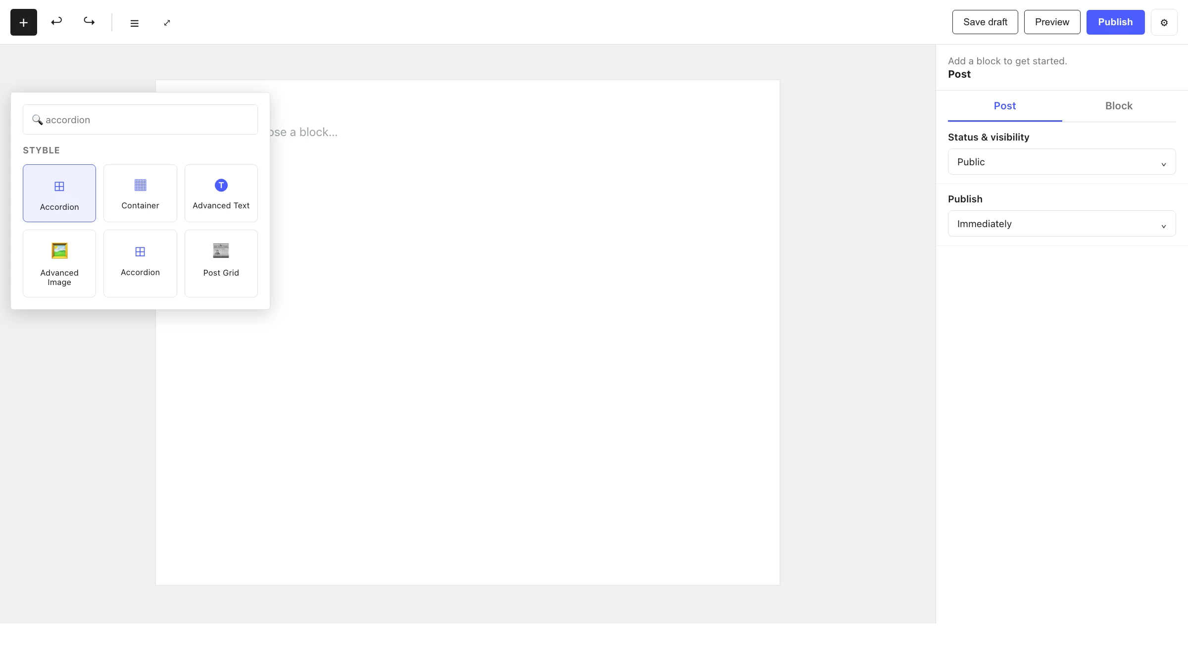
- Click the + block inserter in the editor.
- Search for Accordion and select it.
- The block starts with one or more Accordion Item panels — edit the title and content of each.
- Use the inserter inside the Accordion to add more items.
Settings
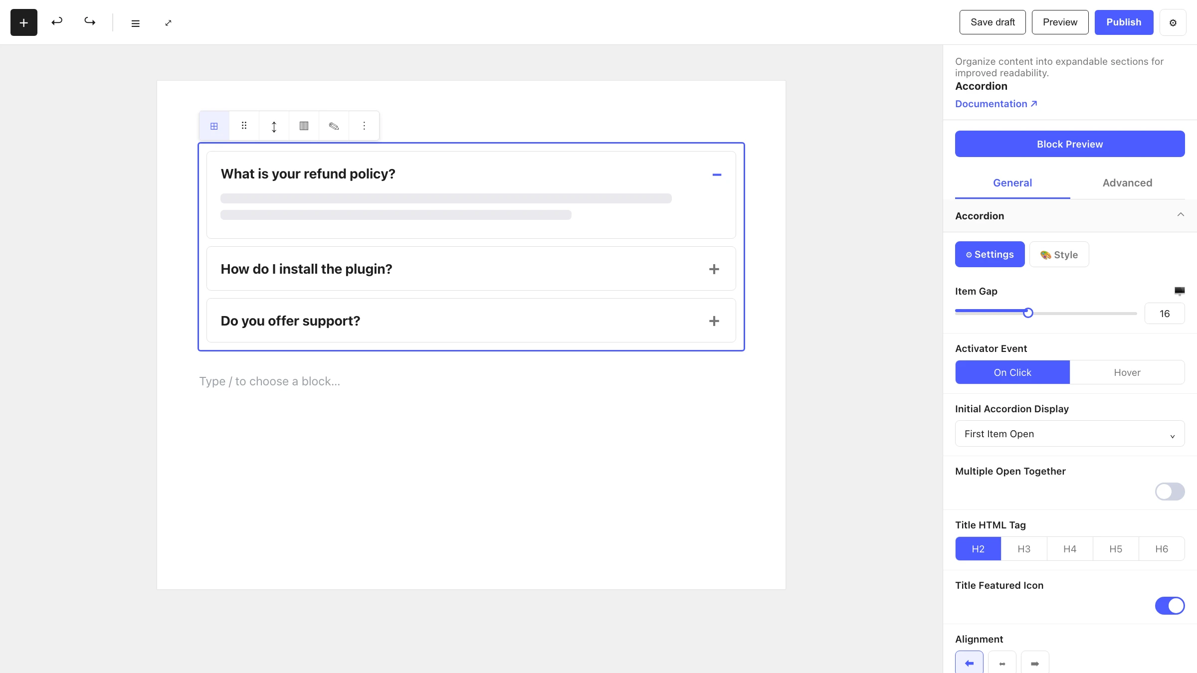
Select the Accordion and open the inspector. Settings are split across two tabs: General (specific to this block) and Advanced (shared by all Styble blocks).
General tab
Each General-tab panel has Settings and Style sub-tabs. The structural controls live under Settings.
Accordion
| Control | What it does |
|---|---|
| Item Gap | Spacing between accordion items (responsive). |
| Activator Event | What opens an item: On Click or Hover. |
| Initial Accordion Display | Which item(s) are open when the page loads. |
| Multiple Open Together | Allow more than one item to stay open at once. |
Title & Content
| Control | What it does |
|---|---|
| Title HTML Tag | Semantic tag for the item title (e.g. H2–H6). |
| Title Featured Icon | Toggle an icon next to the title. |
| Icon Source | Choose between the icon library or a custom uploaded image (shown when the featured icon is on). |
| Choose Icon | Pick the icon from the library or upload a custom image. |
| Icon Size | Size of the title icon. |
| Icon to Title Gap | Spacing between the icon and the title text. |
| Alignment | Align the title left, center or right. |
Expand & Collapse Icon
| Control | What it does |
|---|---|
| Icon Source | Library icon or custom image for the expand toggle. |
| Choose Expand Icon | Pick or upload the icon shown when an item is closed. |
| Collapse Icon | How the collapsed state is shown: Rotation (rotate the expand icon) or Custom (use a separate icon). |
| Scale | Rotation amount in degrees, when Collapse Icon is set to Rotation. |
| Choose Collapse Icon | Pick or upload a separate icon, when Collapse Icon is set to Custom. |
| Icon Size | Size of the toggle icon (responsive). |
| Alignment | Position the toggle icon left, center or right. |
Styling
The Style sub-tab inside each panel controls colors, typography, backgrounds and spacing. These pull from your Global Settings tokens so the accordion stays on-brand.
Advanced tab
The Advanced tab is shared by every Styble block. See Advanced settings.
Accordion Item (child block)
Accordion Item — Single accordion / FAQ item. This is the panel inside an Accordion. It can only be placed inside a parent Accordion block, and it holds your content as inner blocks.
In the editor you edit the panel directly:
- Title — type the panel heading ("Add your accordion title here").
- Content — add any blocks inside the panel ("Add accordion content…").
- Replace Icon — swap the title's featured icon from the item toolbar.
General tab
Accordion Item
| Control | What it does |
|---|---|
| Keep This Item Open | Force this specific item to stay open. Shown only when the parent's Initial Accordion Display is set to the default mode. |
Advanced tab
See Advanced settings.
Nesting & relationships
- Accordion is the parent; Accordion Item blocks live directly inside it.
- An Accordion Item cannot be used on its own — it only appears inside an Accordion.
- Each item can contain any blocks (paragraphs, images, lists, other Styble blocks).
- Supports wide and full width alignment from the block toolbar.
Tips & common patterns
- For an FAQ, set Activator Event to On Click and leave Multiple Open Together off so only one answer shows at a time.
- Use Keep This Item Open on your most important item so visitors see it first.
- Choose Collapse Icon: Rotation with a 180° Scale for the classic chevron flip.
- Define colors and typography in Global Settings so every Accordion matches your theme.