

Container
Build flexible layouts with customizable containers and responsive controls.
The Container is the foundational layout block in Styble Pro. It wraps your content in a flexible, fully responsive box that you can control with flexbox properties — direction, alignment, gaps and wrapping — making it the starting point for almost every Styble layout.
When to use it
- As the outer wrapper for any page section.
- To create flexbox-based layouts (rows, columns, centered content).
- To control width, alignment and spacing of a group of blocks together.
- As a parent for Column blocks to build multi-column structures.
How to add it
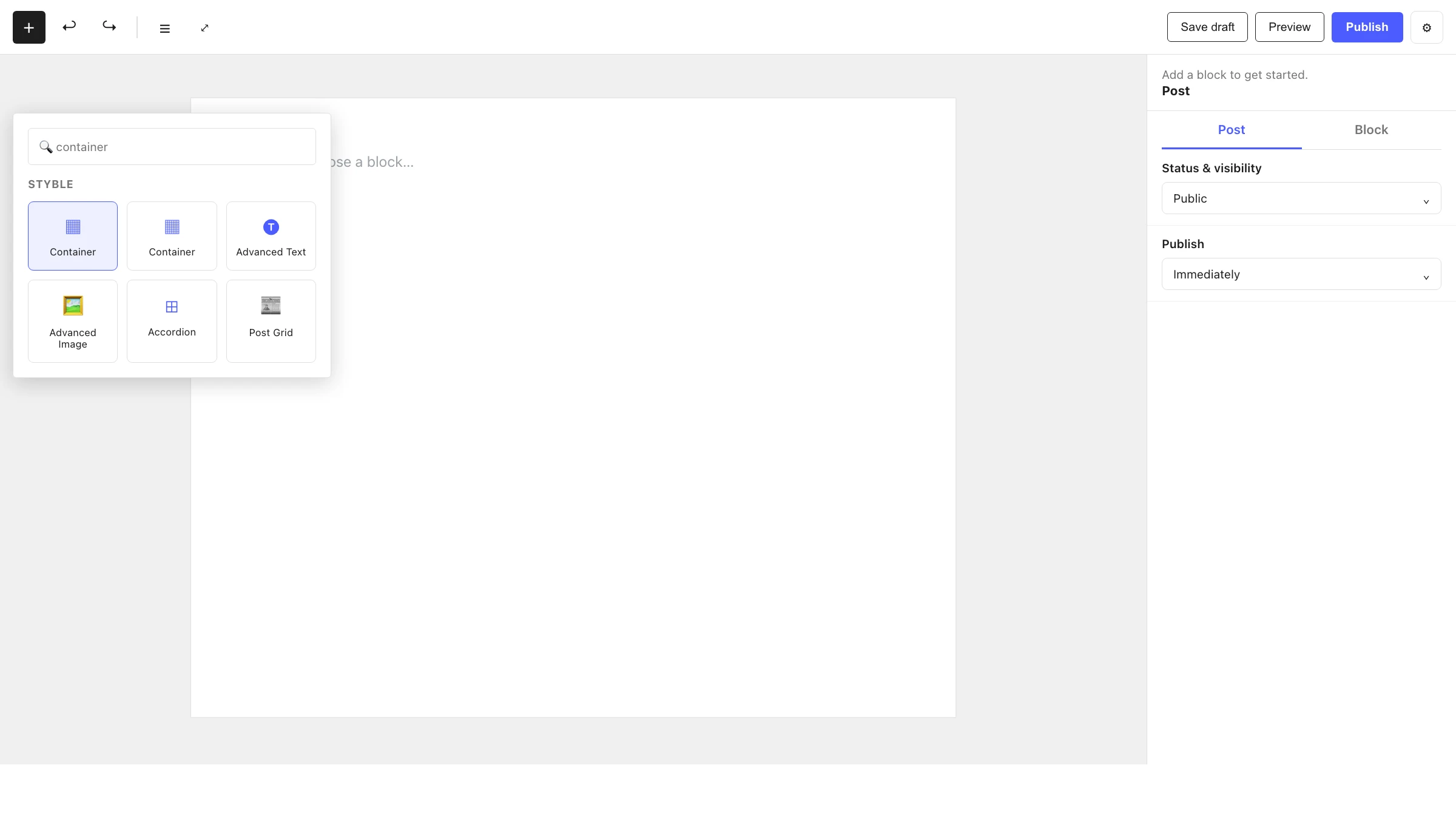
- Click the + block inserter in the editor.
- Search for Container and select it.
- Optionally pick a layout preset to start from, then add your content inside.
Settings
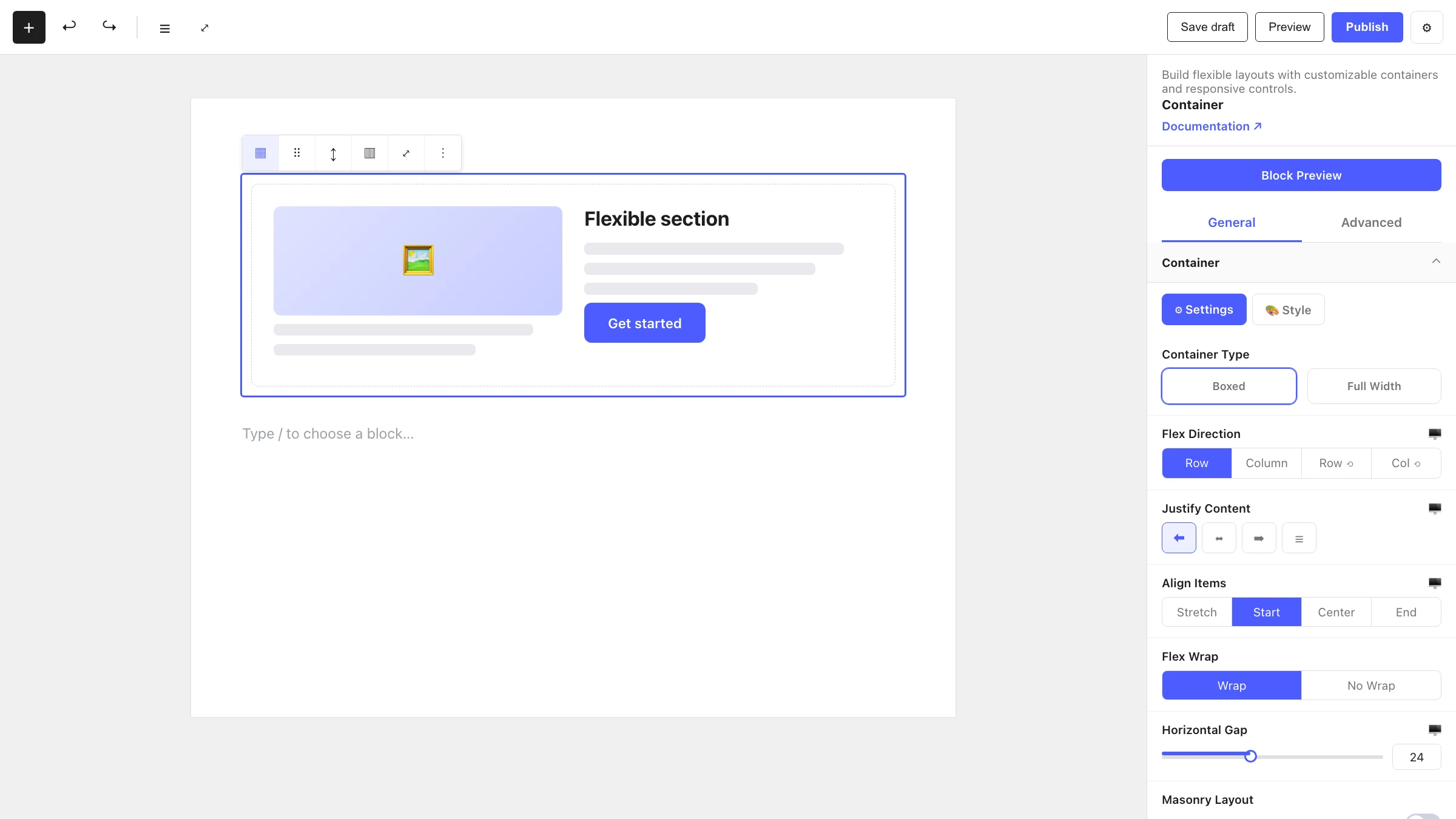
Select the Container and open the inspector on the right. Settings are split across two tabs: General (specific to this block) and Advanced (shared by all Styble blocks).
General tab
Container Type
Choose how the container behaves — including its HTML tag and width mode (for example, boxed vs. full width) and the structure of its content.
Flex Properties
Control the flexbox layout of the container's direct children:
| Control | What it does |
|---|---|
| Flex Direction | Row, Column, Row Reverse or Column Reverse. |
| Align Content | Stretch, Start, Center, End, Space Between or Space Around (for wrapped lines). |
| Justify Content | Start, Center, End, Space Between, Space Around or Space Evenly (main-axis distribution). |
| Align Items | Stretch, Start, Center or End (cross-axis alignment). |
| Flex Wrap | Wrap or No Wrap. |
| Horizontal Gap | Spacing between items horizontally. |
| Vertical Gap | Spacing between items vertically. |
| Masonry Layout | Arrange children in a masonry-style layout. |
Responsive control
The flex and gap controls can be set per device (desktop / tablet / mobile) using the device switcher in the editor toolbar.
Advanced tab
The Advanced tab is shared by every Styble block and provides fine-grained control:
- Section Preferences — general per-block preferences.
- Transform — scale, rotate, skew and offset.
- Scrolling Effects & Motion Effects — scroll- and mouse-driven animations.
- Position — positioning and z-index.
- Masking — apply shape masks.
- Cursor — custom cursor styles.
- Responsive — visibility per device.
- Attribute — custom HTML attributes.
- Custom CSS — block-scoped custom CSS.
See Advanced settings below for the shared reference.
Nesting & relationships
- A Container can hold any blocks, including Column blocks for multi-column layouts.
- Containers can be nested inside other Containers for complex sections.
- Supports wide and full width alignment from the block toolbar.
Tips & common patterns
- Use a Container with Flex Direction: Row plus Flex Wrap: Wrap to create card rows that reflow on smaller screens.
- Set Justify Content: Center and Align Items: Center to perfectly center content (great for hero sections).
- Combine Masonry Layout with multiple children for a Pinterest-style arrangement.
- Define spacing, colors and typography in Global Settings so every Container stays on-brand.
Advanced settings reference
The Advanced tab controls listed above are identical across all Styble blocks. Rather than repeat them on every block page, refer back to this section. For block-level styling tokens (colors, typography, shadows), see Global Settings.