

Info Box
Showcase information with icons, headings, and descriptive content.
The Info Box block combines an icon (or image), a heading and descriptive text into a single, styled unit. It is the go-to block for feature highlights, service cards and callouts. Choose from several layout presets to control how the icon and text are arranged.
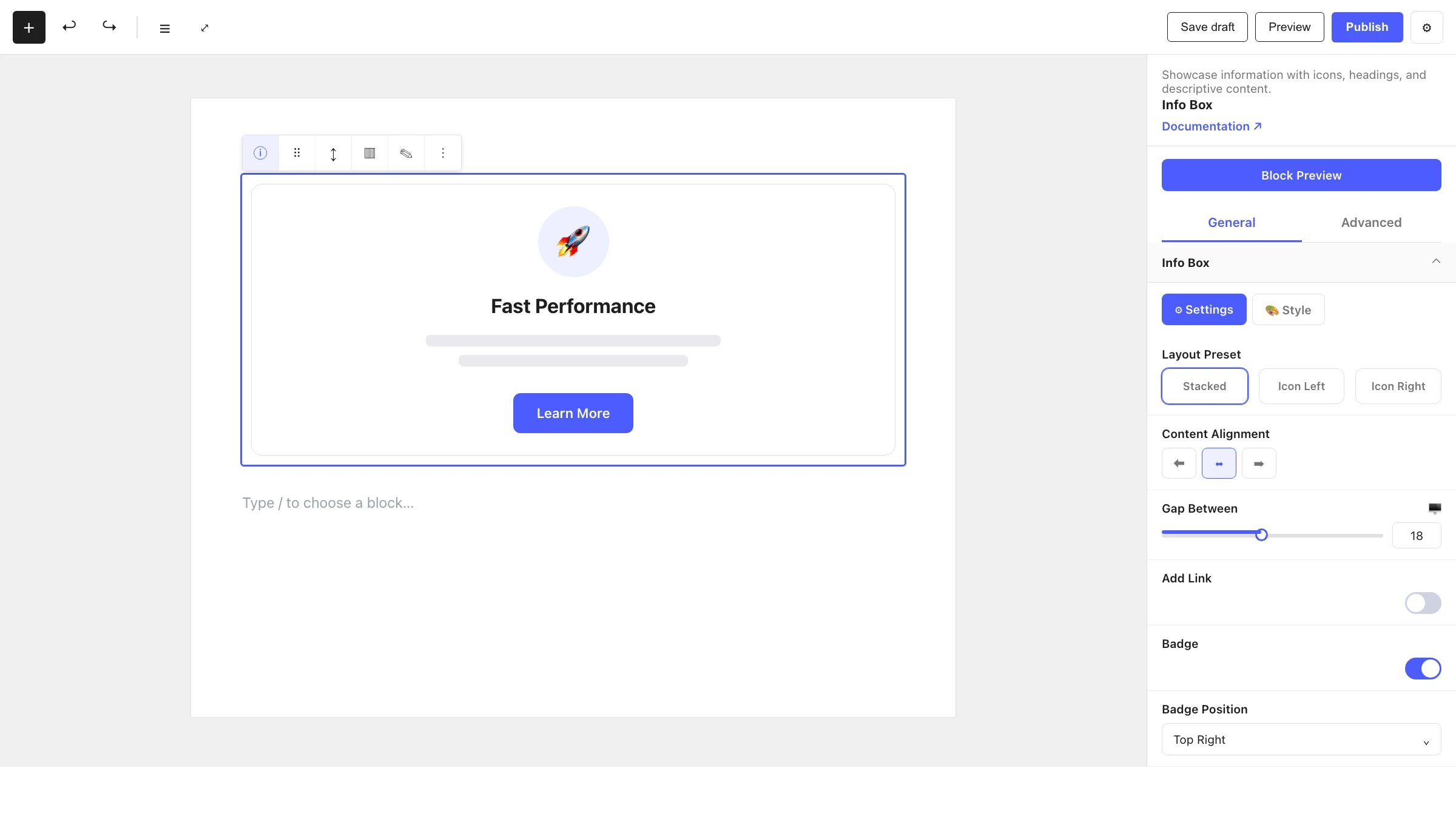
When to use it
- For feature or service cards (icon + title + short description).
- For benefit callouts on landing pages.
- As a repeatable card inside a Container or Column grid.
How to add it
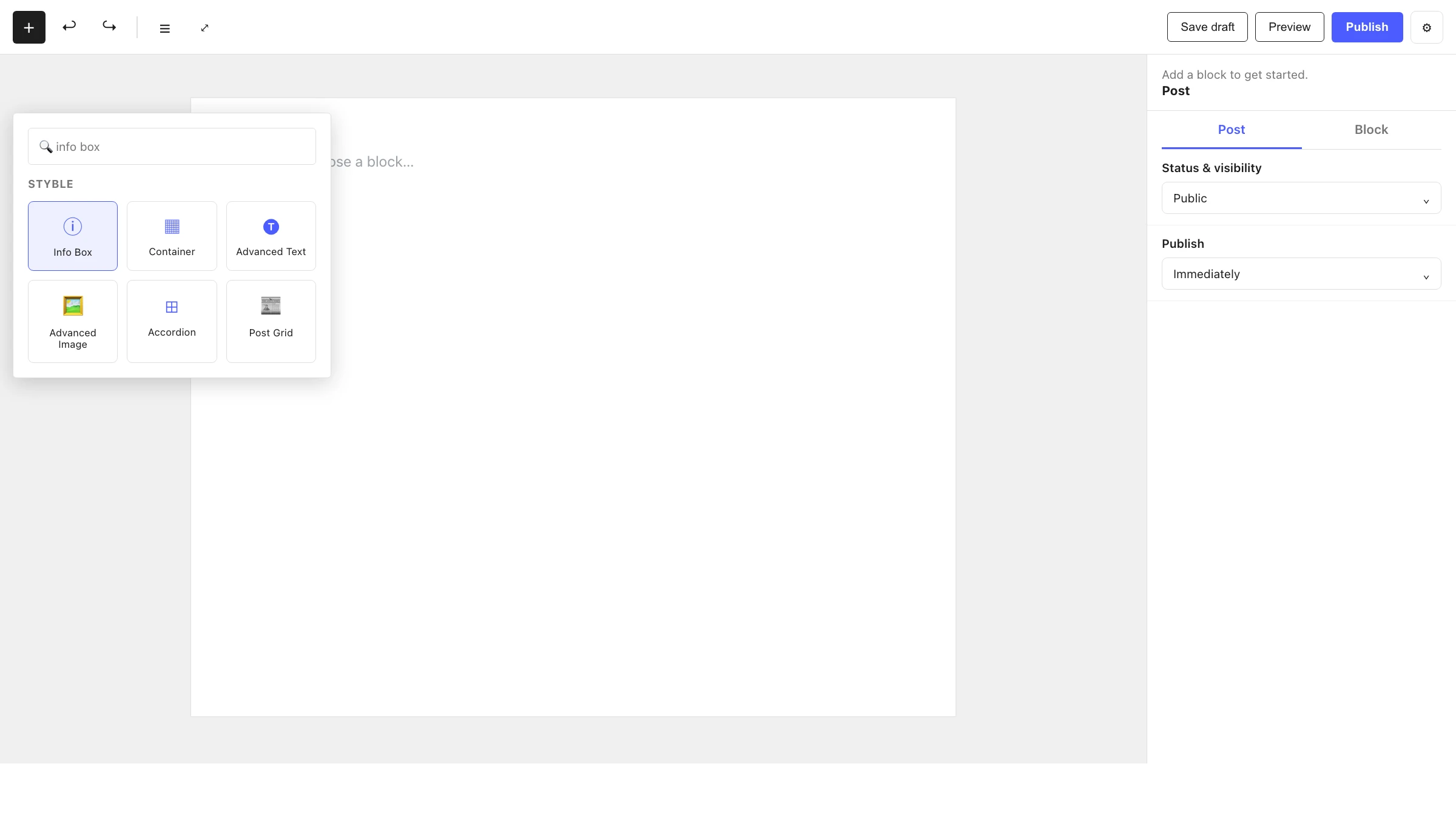
- Click the + block inserter in the editor.
- Search for Info Box and select it.
- Pick a Layout Preset, then edit the icon, heading and description.
Settings
Select the Info Box and open the inspector. Settings are split across two tabs: General (specific to this block) and Advanced (shared by all Styble blocks).
General tab
Info Box
| Control | What it does |
|---|---|
| Layout Preset | Choose one of four arrangements of the icon and content. |
| Content Alignment | Align the content left, center or right. |
| Gap Between | Spacing between the icon and the text content. |
| Add Link | Make the whole box link to a URL, with open in new tab, no-follow and custom relation options. |
Badge
| Control | What it does |
|---|---|
| Badge | Toggle a small badge on the box. |
| Badge Position | Corner where the badge sits (Top/Bottom × Left/Right). |
| Offset | X / Y offset of the badge from its corner. |
Styling
Each panel's Style sub-tab controls colors, typography, backgrounds and spacing, drawing from your Global Settings tokens.
Advanced tab
The Advanced tab is shared by every Styble block. See Advanced settings.
Nesting & relationships
- Info Box is a standalone block — it doesn't require a parent.
- Place several Info Boxes inside a Container (with flex/row + wrap) or Column blocks to build a feature grid.
- Supports wide and full width alignment from the block toolbar.
Tips & common patterns
- Put three or four Info Boxes in a row inside a Container to build a "Features" section.
- Use the Add Link option so the entire card is clickable, not just the title.
- Add a Badge ("Popular", "New") to highlight a standout item.
- Keep layout presets and colors consistent via Global Settings so every card matches.