

Advanced Buttons
Create customizable buttons designed to increase user engagement.
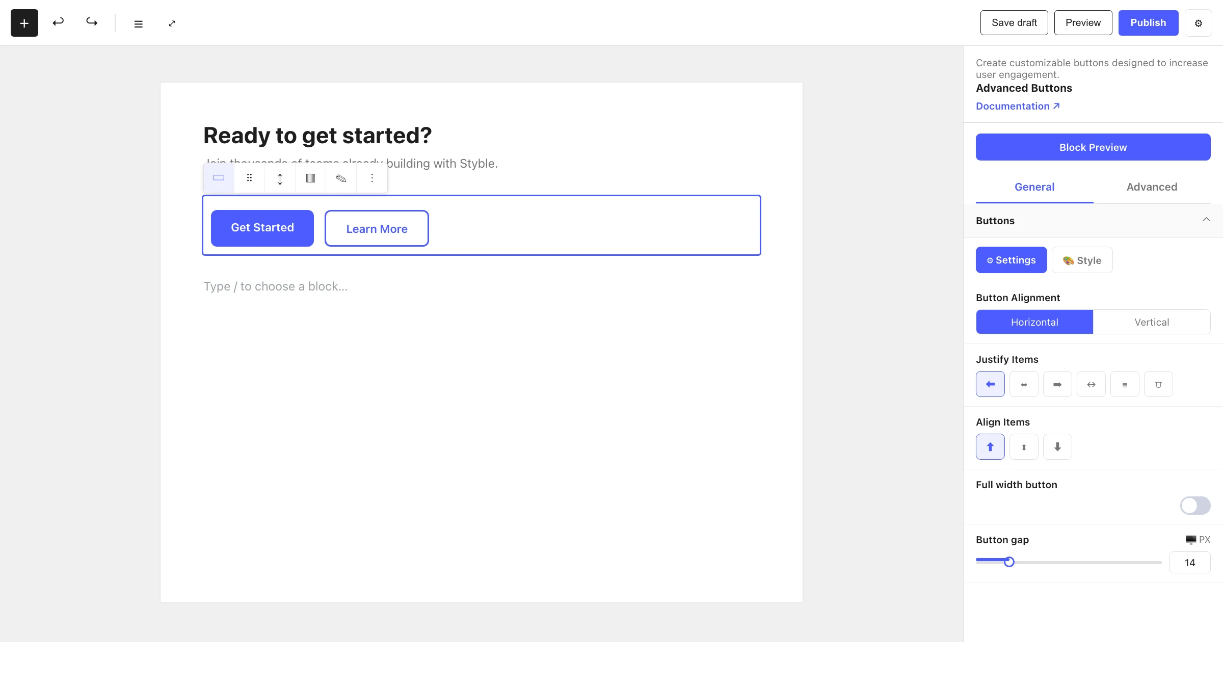
The Advanced Buttons block is a flexible container for one or more call-to-action buttons. It arranges its child Advanced Button blocks horizontally or vertically, controls their alignment and spacing, and lets you build everything from a single CTA to a row of grouped actions.
When to use it
- To add one or more call-to-action buttons to a section.
- To group related actions together (for example, "Get Started" and "Learn More").
- To build button rows that stay aligned and evenly spaced.
- Inside hero sections, cards and Info Box blocks.
How to add it
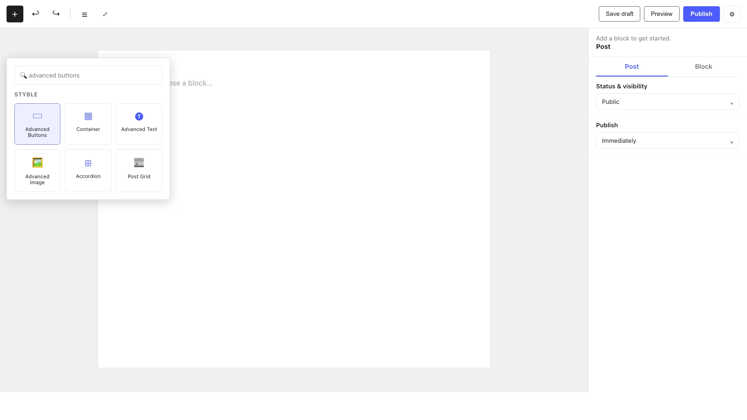
- Click the + block inserter in the editor.
- Search for Advanced Buttons and select it.
- The block starts with two Advanced Button children — edit each one, or add and remove buttons as needed.
Settings
Select the block and open the inspector on the right. Settings are split across two tabs: General (specific to this block) and Advanced (shared by all Styble blocks).
General tab
Buttons
Controls how the group of buttons is laid out:
| Control | What it does |
|---|---|
| Button Alignment | Lay the buttons out horizontally or vertically. |
| Justify Items | Distribute buttons along the main axis — Flex Start, Center, Flex End, Space Between, Space Around or Space Evenly (shown for horizontal direction). |
| Align Items | Cross-axis alignment of the buttons — Flex Start, Center or Flex End. |
| Full width button | Stretch buttons to fill the available width. |
| Button gap | Spacing between buttons (px / em / %). |
Advanced tab
The Advanced tab is shared by every Styble block (Section Preferences, Transform, Scrolling & Motion Effects, Position, Masking, Cursor, Responsive, Attribute, Custom CSS). See Advanced settings for the shared reference.
Advanced Button (child block)
Create customizable button with flexible styles, sizes, and actions.
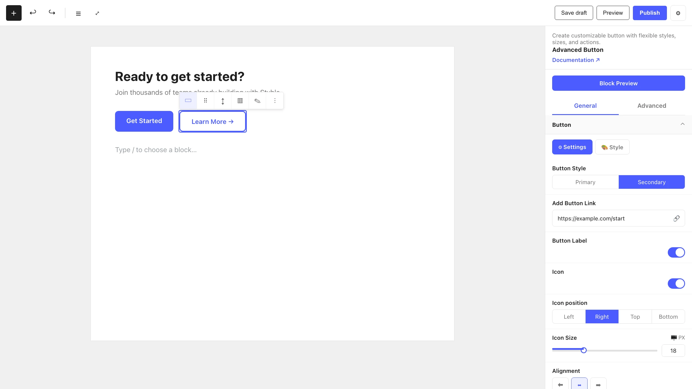
Each individual button is an Advanced Button block. It lives only inside an Advanced Buttons (or Info Box) parent and carries its own label, link, icon and styling.
General tab
Button
| Control | What it does |
|---|---|
| Button Style | Choose Primary or Secondary styling. |
| Add Button Link | Set the destination URL for the button. |
| Button Label | Toggle the text label on/off, then type the label text. |
| Icon | Toggle an icon on/off. |
| Icon Visibility | Show the icon Always or only on Hover. |
| Icon Source | Pick the icon from the icon library or upload your own media. |
| Icon position | Place the icon Right, Left, Top or Bottom relative to the label. |
| Icon Size | Size of the icon (px / em / %). |
| Text to icon gap | Spacing between the label and the icon. |
| Alignment | Align the button's content — Flex Start, Center or Flex End. |
Hover Effect
| Control | What it does |
|---|---|
| Label Effect | Hover animation applied to the label (shown when a label is enabled). |
| Icon Effect | Hover animation applied to the icon (shown when an icon is enabled). |
| Background & Border Effect | Hover animation for the button background and border. |
| Animation Duration | Length of the hover animation, in seconds. |
Advanced tab
Same shared Advanced controls as the parent — see Advanced settings.
Nesting & relationships
- Advanced Button is a child-only block — it can only be placed inside Advanced Buttons or an Info Box.
- The Advanced Buttons parent only allows Advanced Button children, and starts with two by default.
- Add more buttons by selecting the parent and using the block appender; remove buttons you don't need.
Tips & common patterns
- Pair a Primary and a Secondary button to create a clear main action plus a softer alternative.
- Use Button Alignment: Vertical with Full width button for stacked mobile-friendly CTAs.
- Add an icon with Icon position: Right and an Icon Effect to create an arrow that slides on hover.
- Define button colors and typography in Global Settings so every button stays on-brand.