

Icon Picker
Choose icons quickly to enhance visual communication and clarity.
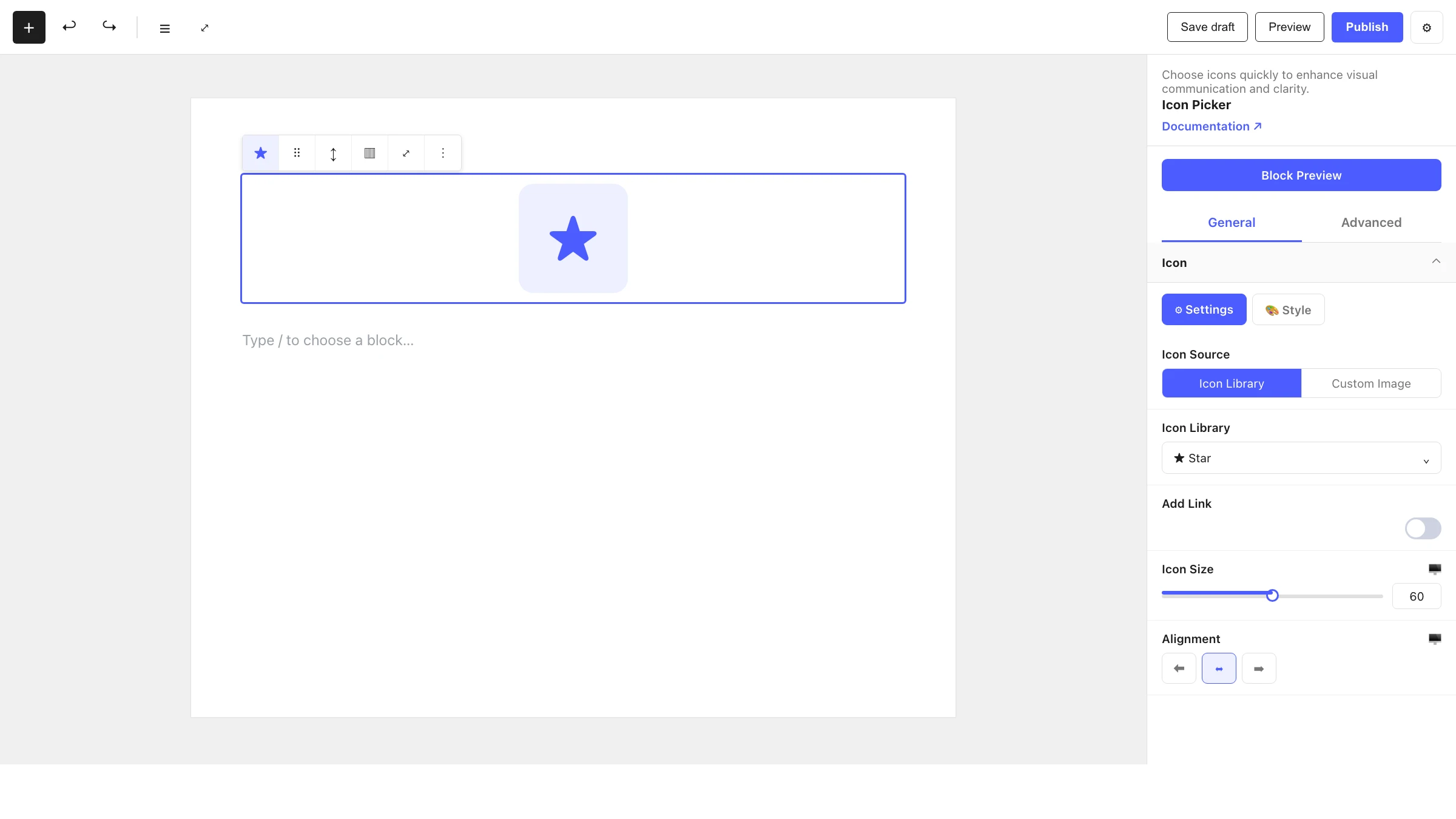
The Icon Picker block lets you drop a single icon into your layout — from the built-in icon library or your own uploaded image — with control over size, alignment and an optional link.
When to use it
- To add a standalone icon as a visual accent.
- To create a linked icon (e.g. a social or download icon).
- To pair icons with Advanced Text for feature lists.
- To use a custom uploaded image as an icon.
How to add it
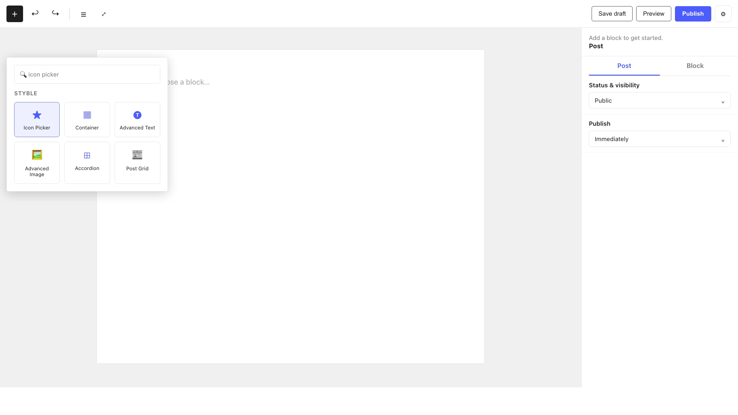
- Click the + block inserter in the editor.
- Search for Icon Picker and select it.
- Pick an icon from the library (or upload one), then set its size, alignment and link.
Settings
Select the block and open the inspector on the right. Settings are split across two tabs: General (specific to this block) and Advanced (shared by all Styble blocks). The Icon panel also has Settings and Style sub-tabs.
General tab
Icon
| Control | What it does |
|---|---|
| Icon Source | Choose the icon library or a custom uploaded image. |
| Icon Library | Browse and select an icon (when using the library source). |
| Custom Image | Upload your own image (when using the custom source). |
| Add Link | Wrap the icon in a URL (with new-tab / nofollow options). |
| Icon Size | Size of the icon (px / em / %). |
| Alignment | Align the icon start, center or end. |
Advanced tab
The Advanced tab is shared by every Styble block (Section Preferences, Transform, Scrolling Effects, Motion Effects, Position, Masking, Cursor, Responsive, Attribute, Custom CSS). See Advanced settings for the full reference.
Nesting & relationships
- Icon Picker can be placed anywhere, including inside a Container or Column.
- Supports wide and full width alignment from the block toolbar.
Tips & common patterns
- Place an Icon Picker above an Advanced Text heading to build feature cards.
- Use Add Link with a custom image source for branded social or app-store icons.
- Set the icon color via Global Settings so all icons stay consistent.