

Icon List
Display features and highlights using attractive icon-based lists.
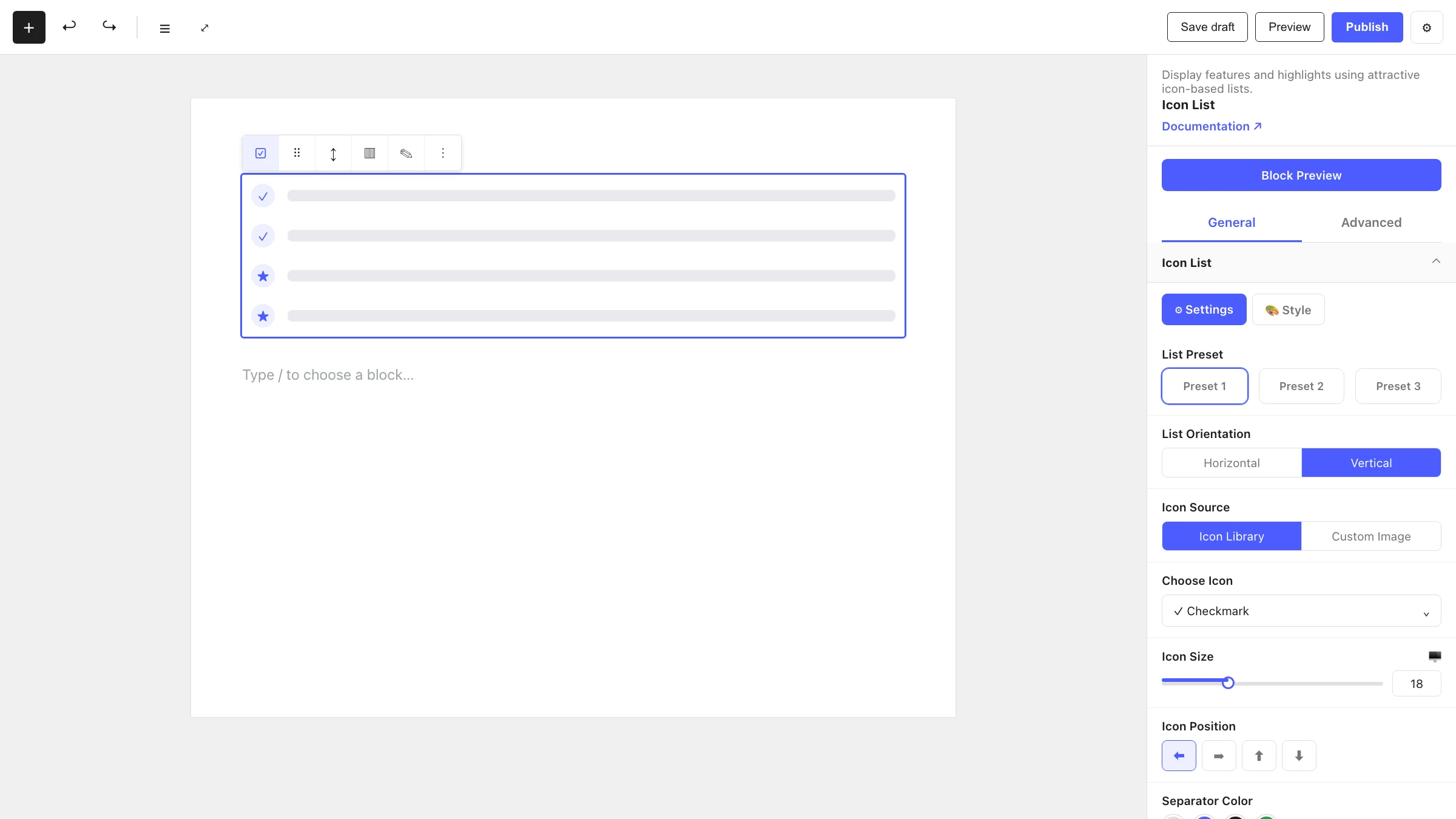
The Icon List block builds a list where each row pairs an icon (or number) with text. It is great for feature lists, checklists, contact details and any content that reads better with a visual marker. Each row is an Icon List Item child block.
When to use it
- For feature or benefit lists where each point gets a checkmark or icon.
- For contact info rows (phone, email, address) with matching icons.
- For ordered/numbered lists with custom styling.
- Anywhere a plain bullet list would benefit from icons and richer layout.
How to add it
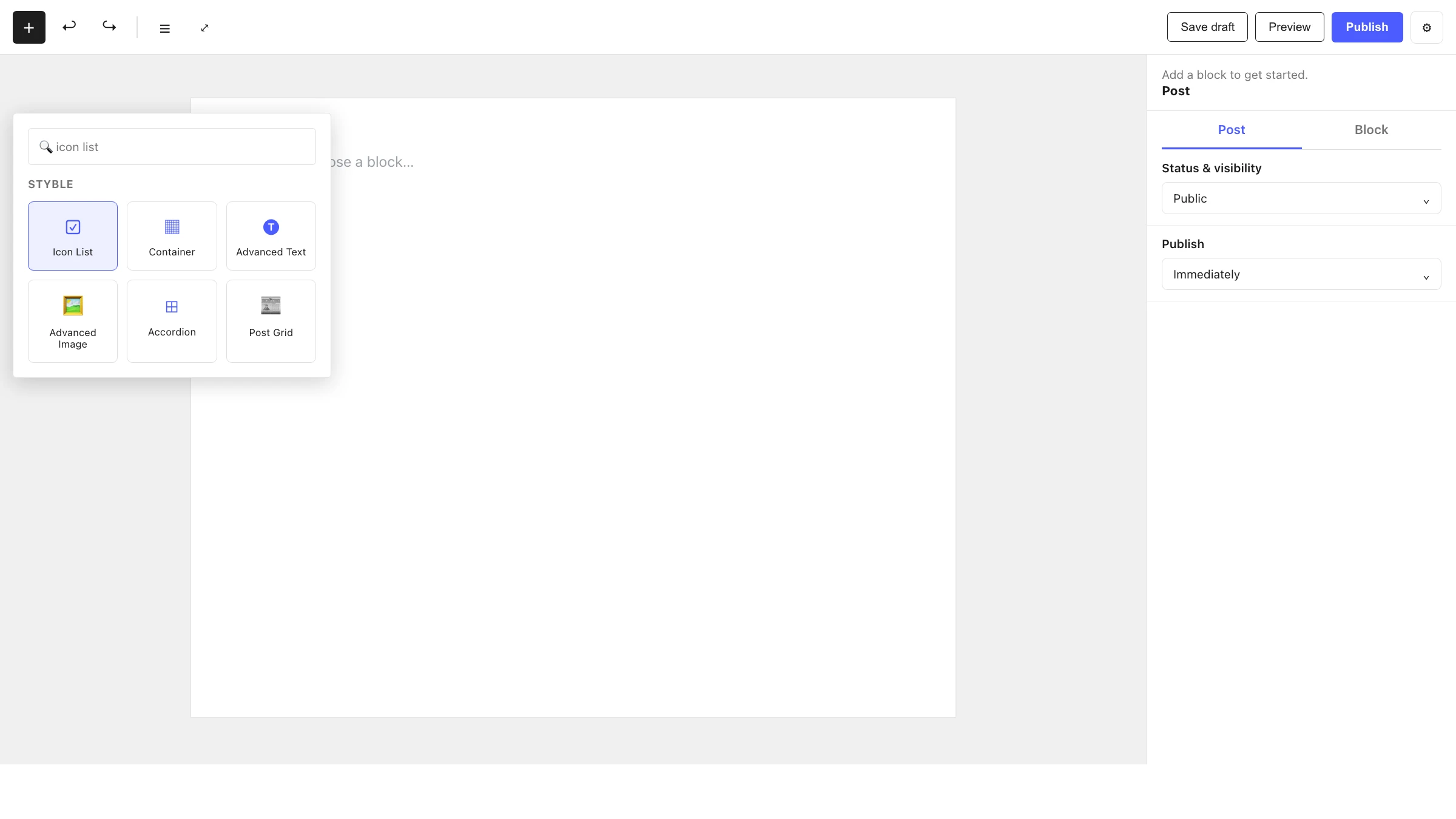
- Click the + block inserter in the editor.
- Search for Icon List and select it.
- Pick a List Preset, then edit each Icon List Item row.
- Use the inserter inside the list to add more items.
Settings
Select the Icon List and open the inspector. Settings are split across two tabs: General (specific to this block) and Advanced (shared by all Styble blocks).
General tab
The Icon List panel has Settings and Style sub-tabs. The structural controls live under Settings.
Icon List
| Control | What it does |
|---|---|
| List Preset | Choose one of three list layout styles. |
| List Orientation | Horizontal or Vertical list (not available in the third preset). |
| Icon Source | Library icon or a custom uploaded image (when the marker type is an icon). |
| Choose Icon | Pick or upload the marker icon. |
| Icon Size | Size of the icon marker. |
| Icon Position | Place the icon Left, Right, Top or Bottom of the text. |
| Ordered Style | Numbering style for ordered lists: numeric, alphabetical or roman. |
| Ordered Position | Place the number relative to the text. |
| Order Size | Size of the number marker. |
| Separator | Style, Thickness and Color of the line between items. |
| Thickness | Connection-line thickness (third preset only). |
Marker type
Whether the icon or ordered (numbered) controls appear depends on the marker type set for the list. The Style sub-tab controls text and icon colors, typography and spacing, drawing from your Global Settings tokens.
Advanced tab
The Advanced tab is shared by every Styble block. See Advanced settings.
Icon List Item (child block)
Icon List Item — A single item for the icon list. This is one row inside an Icon List. It can only be placed inside a parent Icon List block. You type the row's text directly in the editor, and it can optionally show a badge.
General tab
List Item
| Control | What it does |
|---|---|
| Text HTML Tag | Semantic tag for the row text (H1–H6 or P). |
| Add Link | Make the row link to a URL, with open in new tab, no-follow and custom relation options. |
Badge
| Control | What it does |
|---|---|
| Badge | Toggle a small badge on the row. |
| Badge Position | Corner where the badge sits (Top/Bottom × Left/Right). |
| X Offset | Horizontal nudge of the badge. |
| Y Offset | Vertical nudge of the badge. |
Advanced tab
See Advanced settings.
Nesting & relationships
- Icon List is the parent; Icon List Item rows live directly inside it.
- An Icon List Item cannot be used on its own — it only appears inside an Icon List.
- Marker and separator settings are controlled at the list level and apply to every row.
Tips & common patterns
- Use a checkmark icon with List Orientation: Vertical for a clean feature checklist.
- Switch to an ordered marker type for numbered step-by-step lists.
- Set Icon Position: Top with a horizontal orientation to create icon-card rows.
- Add a Badge to a row ("New", "Pro") to draw attention to standout items.
- Define icon and text colors in Global Settings so the list stays on-brand.