

Advanced Tabs
Display content efficiently using customizable tabbed navigation layouts.
The Advanced Tabs block lets you organize content into a set of tabs with a navigation bar and switchable panels. It is ideal for grouping related content (features, pricing plans, specs) into a compact, interactive area. Each panel is a Tab content child block.
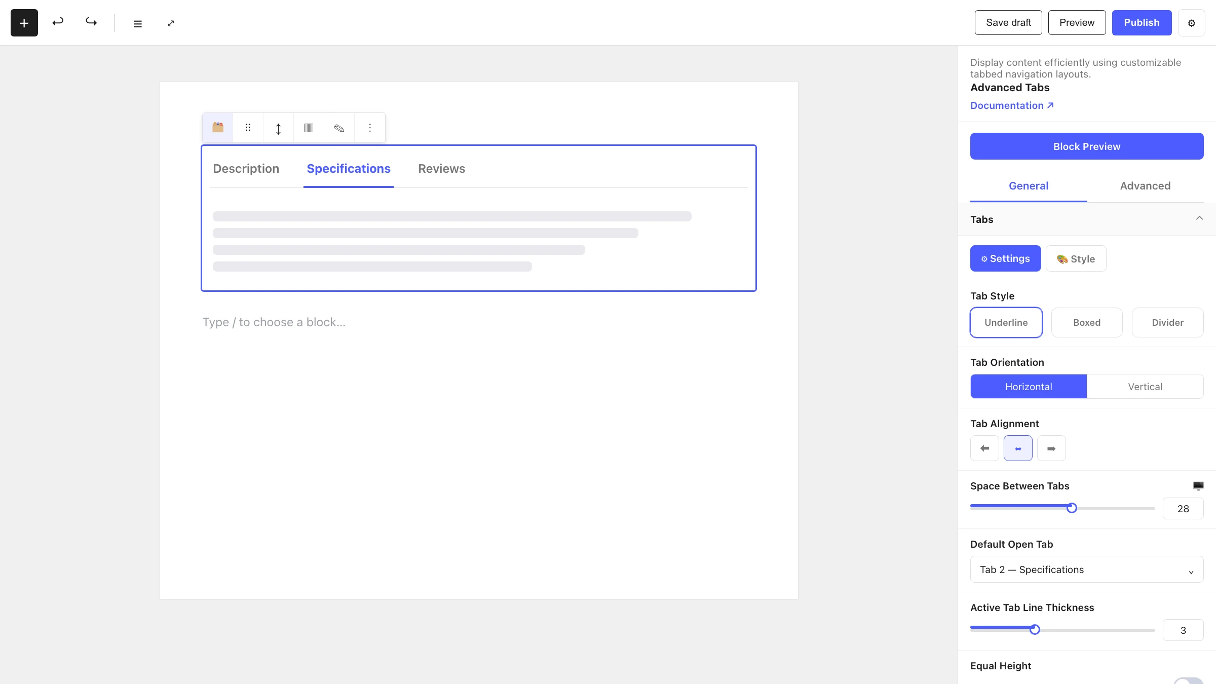
See it in action

When to use it
- To present related content groups (e.g. Description / Specs / Reviews) in one compact area.
- For feature comparisons, pricing tiers or product variations.
- Anywhere you want to save vertical space by letting visitors switch between panels.
How to add it
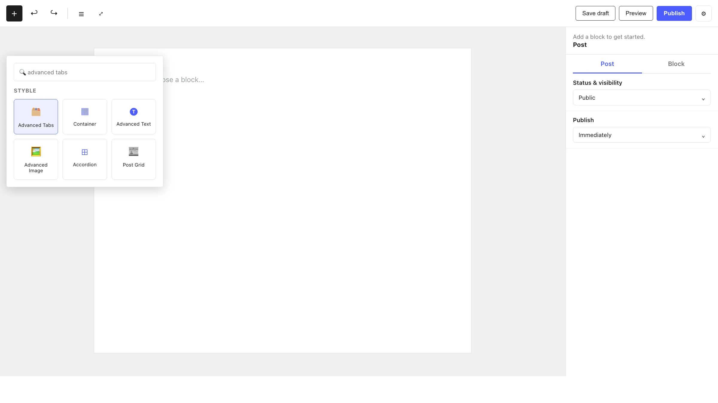
- Click the + block inserter in the editor.
- Search for Advanced Tabs and select it.
- Use the tab toolbar to add, rename, reorder or remove tabs.
- Select a tab and add any blocks into its Tab content panel.
Settings
Select the Advanced Tabs block and open the inspector. Settings are split across two tabs: General (specific to this block) and Advanced (shared by all Styble blocks).
General tab
Each General-tab panel has Settings and Style sub-tabs. The structural controls live under Settings.
Tabs
| Control | What it does |
|---|---|
| Tab Style | Choose one of four navigation styles (underline, boxed, divider, etc.). |
| Tab Orientation | Horizontal or Vertical tab navigation. |
| Tab Alignment | Align the tabs left, center or right. |
| Space Between Tabs | Gap between the tab buttons (responsive). |
| Default Open Tab | Which tab is active when the page loads. |
| Active Tab Line Thickness | Thickness of the active indicator line (Style 1 only). |
| Bottom Line Thickness | Thickness of the navigation baseline (available except Style 2). |
Subtitle
| Control | What it does |
|---|---|
| Subtitle | Toggle a secondary line of text under each tab label. |
| Subtitle Alignment | Align the subtitle text. |
| Position | Where the subtitle sits relative to the label. |
Icon
| Control | What it does |
|---|---|
| Icon | Toggle an icon on each tab. |
| Icon Size | Size of the tab icon. |
| Icon Position | Place the icon relative to the label. |
| Icon to Label Gap | Spacing between the icon and the label. |
| Icon Alignment | Align the icon within the tab. |
Tab Content
| Control | What it does |
|---|---|
| Content Height | Set how the panel height is determined. |
| Equal Height | Make every panel the same height. |
Styling
The Style sub-tab inside each panel controls typography, colors, backgrounds, borders, radius and spacing. Colors and fonts pull from your Global Settings tokens.
Advanced tab
The Advanced tab is shared by every Styble block. See Advanced settings.
Tab content (child block)
Tab content — Content area for a single tab. This is the panel that shows when its tab is active. It can only be placed inside an Advanced Tabs block.
- Each tab in the navigation has a matching Tab content panel.
- Select a tab to reveal and edit its panel — inactive panels are hidden in the editor.
- A panel can hold any blocks (paragraphs, images, columns, other Styble blocks).
- The Tab content block has no General-tab controls of its own; styling comes from the parent's Tab Content panel and the shared Advanced settings.
Nesting & relationships
- Advanced Tabs is the parent; each Tab content panel lives directly inside it.
- Tab content cannot be used on its own — it only appears inside Advanced Tabs.
- The number of panels stays in sync with the tabs you add in the navigation.
- Supports wide and full width alignment from the block toolbar.
Tips & common patterns
- Use Vertical orientation for sidebars or settings-style layouts where labels sit beside the content.
- Turn on Equal Height so the surrounding layout doesn't jump when switching between panels of different lengths.
- Enable the Subtitle to add a short descriptor under each tab label (e.g. price under a plan name).
- Define colors and typography in Global Settings so your tabs stay consistent across the site.