

Column
Organize content into responsive columns with flexible layouts.
The Column block is the building block that lives inside a Container. Each Column is a flexible, fully responsive cell that can hold any other blocks, letting you split a section into multiple side-by-side areas with independent width and flex behaviour.
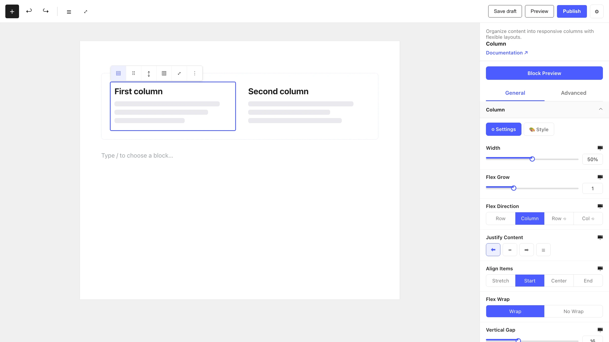
When to use it
- To divide a Container into multiple side-by-side areas.
- To build multi-column layouts such as feature grids, pricing tables or content + sidebar.
- To control the width and flex growth of an individual cell within a row.
- To group blocks together so they reflow as a unit on smaller screens.
How to add it
- Add a Container block, or select an existing one.
- Choose a layout preset (the columns are created for you), or use the + inserter inside the Container.
- Search for Column and add it, then place your content inside each Column.
Settings
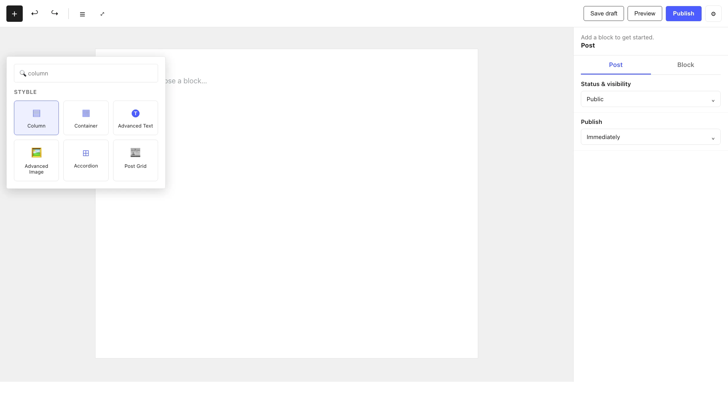
Select a Column and open the inspector on the right. Settings are split across two tabs: General (specific to this block) and Advanced (shared by all Styble blocks).
General tab
Column
Controls the column's size and the flexbox layout of the blocks it contains:
| Control | What it does |
|---|---|
| Width | Sets the column's width (responsive). |
| Flex Grow | How much the column grows to fill available space relative to its siblings. |
| Flex Direction | Row, Column, Row Reverse or Column Reverse for the column's children. |
| Align Content | Stretch, Start, Center, End, Space Between or Space Around (for wrapped lines). |
| Justify Content | Main-axis distribution of the column's children. |
| Align Items | Cross-axis alignment of the column's children. |
| Flex Wrap | Wrap or No Wrap. |
| Horizontal Gap | Spacing between items horizontally. |
| Vertical Gap | Spacing between items vertically. |
Responsive control
Width, gap and flex controls can be set per device (desktop / tablet / mobile) using the device switcher in the editor toolbar.
Advanced tab
The Advanced tab is shared by every Styble block (Section Preferences, Transform, Scrolling Effects, Motion Effects, Position, Masking, Cursor, Responsive, Attribute, Custom CSS). See Advanced settings for the full reference.
Nesting & relationships
- A Column is designed to live inside a Container block.
- A Column can hold any blocks, including nested Containers and Columns.
- Supports wide and full width alignment from the block toolbar.
- Column widths are usually managed by the parent Container's layout preset, but you can fine-tune each column's Width and Flex Grow individually.
Tips & common patterns
- Set equal Flex Grow values across columns for evenly sized cells, or vary them for an asymmetric (e.g. 2:1) layout.
- Use Width with a percentage for precise control, then let Flex Wrap on the parent Container reflow columns on mobile.
- Combine Justify Content: Center and Align Items: Center inside a Column to center its content.
- Define spacing, colors and typography in Global Settings so every Column stays on-brand.