

Advanced Text
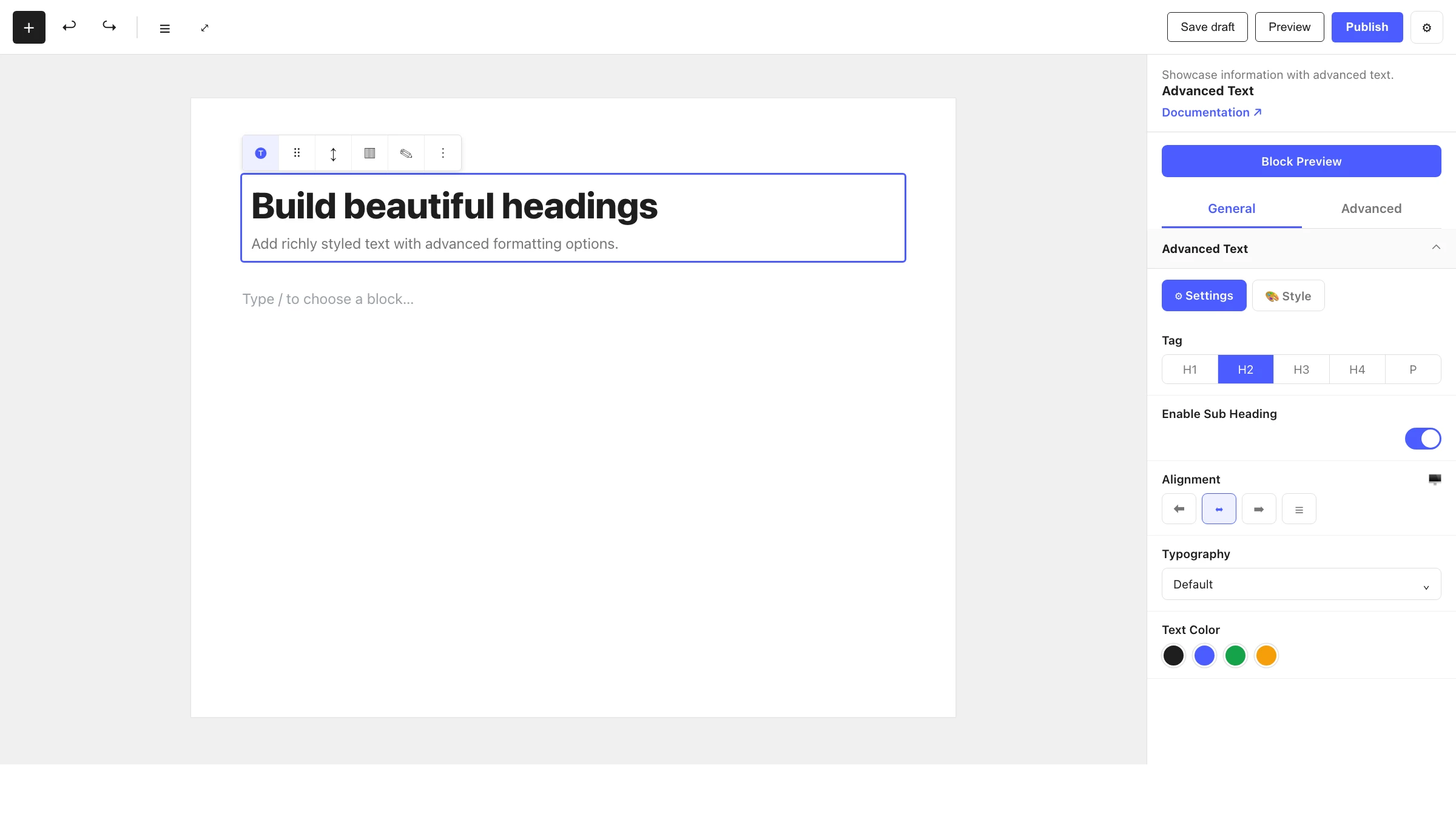
Add richly styled text with advanced formatting options.
The Advanced Text block is a powerful replacement for the standard heading and paragraph blocks. It combines a main text element, an optional sub heading and an optional drop cap, with controls for HTML tag, alignment, multi-column layout and orientation.
When to use it
- For section headings and titles that need precise styling control.
- To pair a heading with a styled sub heading (eyebrow / kicker text).
- For long-form text that should flow into a multi-column layout.
- To add an editorial drop cap to the opening paragraph.
- For vertical or rotated text using the orientation options.
How to add it
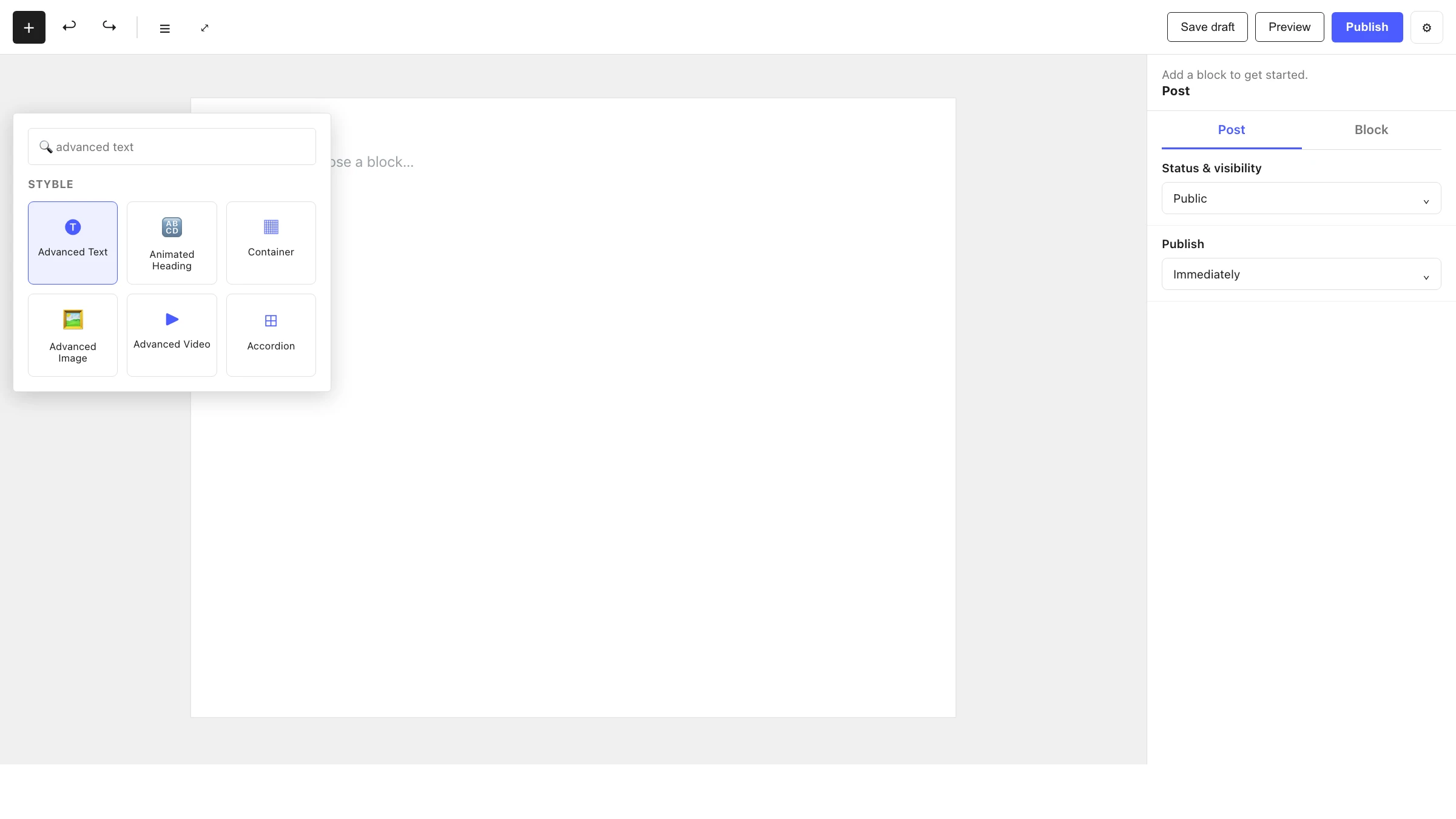
- Click the + block inserter in the editor.
- Search for Advanced Text and select it.
- Type your content inline, then open the inspector to set the tag, alignment and any extras.
Settings
Select the block and open the inspector on the right. Settings are split across two tabs: General (specific to this block) and Advanced (shared by all Styble blocks). Each General panel additionally has its own Settings and Style sub-tabs.
General tab
Text
The main text element settings:
| Control | What it does |
|---|---|
| HTML Tag | Choose the tag: H1–H6 or P. |
| Alignment | Left, Center or Right. |
| Text Orientation | Pick one of three orientation modes (horizontal or rotated/vertical flow). |
| Max Content Height | Limits content height (shown for the non-default orientations), with px / % / em units. |
| Multi Column | Toggle to flow text into multiple columns. |
| Columns | Number of columns (when Multi Column is on). |
| Column Gap | Spacing between columns. |
| Divider | Toggle a divider line between columns. |
| Divider Width | Width of the column divider. |
Sub Heading
Enable the Sub Heading toggle to add a secondary line:
| Control | What it does |
|---|---|
| HTML Tag | Tag for the sub heading: H1–H6 or P. |
| Icon | Toggle an icon alongside the sub heading. |
| Position | Place the sub heading on Top or Bottom (relative to the main text). |
| Alignment | Left, Center or Right. |
Drop Cap
Enable the Drop Cap toggle to enlarge the first letter:
| Control | What it does |
|---|---|
| Drop Cap Style | Dropped or In Margin. |
Drop Cap requirement
The drop cap only works when the content starts with a regular paragraph. If it begins with a heading, list or other element, the effect is not applied.
TIP
The Drop Cap panel is part of an extension module and appears only when that module is active.
Advanced tab
The Advanced tab is shared by every Styble block (Section Preferences, Transform, Scrolling Effects, Motion Effects, Position, Masking, Cursor, Responsive, Attribute, Custom CSS). See Advanced settings for the full reference.
Nesting & relationships
- Advanced Text can be placed anywhere, including inside a Container or Column.
- Supports wide and full width alignment from the block toolbar.
Tips & common patterns
- Use the Sub Heading with Position: Top as an eyebrow line above a large H2 title.
- Turn on Multi Column with a Divider for magazine-style body copy.
- Set typography, colors and shadows once in Global Settings so every Advanced Text block matches your brand.
- Each panel's Style sub-tab handles colors and typography; the Settings sub-tab documented above handles structure and behaviour.