

Image Gallery
Showcase collections of images in beautiful gallery layouts.
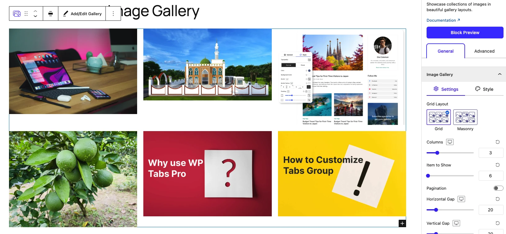
The Image Gallery block presents a collection of images in flexible, responsive layouts. Each image is a Gallery Image child block, and the gallery controls the shared layout, lightbox, content overlays, hover animations, filtering and search for all of its images at once.
When to use it
- To display portfolios, product shots, team photos or screenshots.
- To build a filterable gallery where visitors narrow images by category.
- To open images in a lightbox or link them to URLs.
- To add titles and descriptions over or beside each image.
How to add it
- Click the + block inserter in the editor.
- Search for Image Gallery and select it.
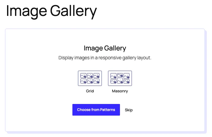
- Choose a starting layout — Grid or Masonry — or click Choose from Patterns to start from a pre-built design (or Skip to start empty).
- Add images to populate the gallery — each becomes a Gallery Image child block.
- Adjust the layout, columns and gaps from the inspector.
Settings
Select the block and open the inspector on the right. Settings are split across two tabs: General (specific to this block) and Advanced (shared by all Styble blocks). The General tab is organized into four panels.
General tab
Image Gallery
The main layout and display panel:
| Control | What it does |
|---|---|
| Grid Layout | Choose a Grid or Masonry layout. |
| Columns | Number of columns (1–10). |
| Item to Show | How many images to show before pagination (1–200). |
| Pagination | Enable AJAX pagination — attaches the Ajax Pagination child when there are more images than fit on one page. |
| Horizontal Gap / Vertical Gap | Spacing between images (0–100px). |
| Aspect Ratio | Original, 1:1, 4:3, 3:4, 3:2, 2:3, 16:9, 9:16 or Custom. |
| Max Width / Width & Height | Constrain image dimensions (Width/Height appear for a Custom aspect ratio). |
| Image Resolution | Thumbnail, Medium, Large or Full. |
| Order By | Default or Random ordering. |
| Alignment | Align the gallery — Start, Center or End. |
| Click Event | What happens on click — None, Lightbox or URL. |
| Lightbox Click Action | Open via the Full Image or an Icon (Lightbox only). |
| Lightbox Icon Source / Position / Visibility | Choose the lightbox icon, place it (Top/Bottom Left/Right or Center) and show it Always or on Hover. |
| Open In New Tab | Open URL links in a new tab (URL click event only). |
The panel's Style tab adds image overlay (transparent / solid / gradient), border, border radius, box shadow and margin, each with Normal and Hover states.
Image Filter & Search
Adds a front-end filter bar and search field:
| Control | What it does |
|---|---|
| Image Filter | Enable category filtering for the gallery. |
| Filter Style | Render filters as Buttons or a Dropdown. |
| Show "All" / Label for "All" | Show an "all images" filter and set its label. |
| Filter Alignment | Align the filter bar Left, Center or Right. |
| Gap Between Filters | Spacing between filter items (0–80px). |
| Search | Enable a search field. |
| Search Placeholder Label | Placeholder text for the search field. |
| Search Field Width | Width of the search field (px / %). |
| Justify | Distribute the filter/search row — Start, Center, End or Space Between. |
| Filter to Search Gap | Spacing between the filter bar and search field. |
The Style tab styles filter buttons (typography, colors, background, border per Normal/Hover/Active state), the search field and the overall filter area.
Content
Controls the title and description shown with each image:
| Control | What it does |
|---|---|
| Image Title / Image Title Source | Show a title, sourced from the attachment title or caption. |
| HTML Tag | Title tag — H1–H6 or Span. |
| Image Description / Image Description Source | Show a description, sourced from caption or attachment description. |
| Description Limit | Trim the description by words or lines. |
| Alignment | Align content Left, Center or Right. |
| Title to Desc. Gap | Spacing between title and description. |
| Content Display Style | Normal (below/above image), Overlay (over image) or Diagonal banner. |
| Content Vertical Alignment / Position / Width | Position the content within the overlay (Overlay style). |
| Diagonal Style | Left or Right diagonal (Diagonal style). |
| Content Position / Content to Image Gap | Place content Top or Bottom and set its gap (Normal style). |
| Content Visibility | Show content Always or on Hover (Overlay/Diagonal styles). |
The Style tab controls title/description typography and color, content background, border, border radius and padding.
Hover Animation and Effects
| Control | What it does |
|---|---|
| Image Animation | Hover animation for the image (Jazz, Apollo, Selena, Pop, Bounce, Rotate, Float, Skew, Zoom and Move variants, and more). |
| Content Effect | Reveal animation for the content (Fade, Slide, Flip, Flash, Wobble variants). |
| Easing | Easing curve for the animations. |
| Animation Duration / Animation Delay | Timing of the animations (0–10s). |
Advanced tab
The Advanced tab is shared by every Styble block (Section Preferences, Transform, Scrolling & Motion Effects, Position, Masking, Cursor, Responsive, Attribute, Custom CSS). See Advanced settings for the shared reference.
Gallery Image (child block)
A single image inside the Image Gallery.
Each image in the gallery is a Gallery Image block (block title: Gallery Image). It exists only inside an Image Gallery parent and inherits the gallery's layout, lightbox, content and animation settings through context — so you configure those once on the parent and they apply to every image.

General tab
Image
| Control | What it does |
|---|---|
| Upload Image | Choose the image (with focal-point support). |
| Add Link | Optional per-image link. |
| Alternative Text | Alt text for accessibility. |
The Style tab adds blend mode, a Normal/Hover image filter (blur, brightness, contrast, saturation, hue) and opacity.
Advanced tab
Same shared Advanced controls — see Advanced settings.
Nesting & relationships
- Gallery Image is a child-only block — it can only be placed inside Image Gallery.
- The gallery passes its layout, lightbox, content-display and animation settings to every Gallery Image via block context, so children stay consistent with the parent.
- When Pagination is enabled and there are more images than Item to Show, the gallery attaches the Ajax Pagination child block automatically — you don't insert it manually.
Tips & common patterns
- Use Masonry with mixed-orientation images for a Pinterest-style wall.
- Enable Image Filter with category terms so visitors can narrow large galleries.
- Set Content Display Style: Overlay with Content Visibility: Hover to reveal captions only on hover.
- Combine Click Event: Lightbox with an icon trigger for a clean, distraction-free viewer.
- Define colors and typography in Global Settings so the gallery matches your theme.